Sector Rotation Explained: How Capital Moves Through the Markets – and How to Spot It
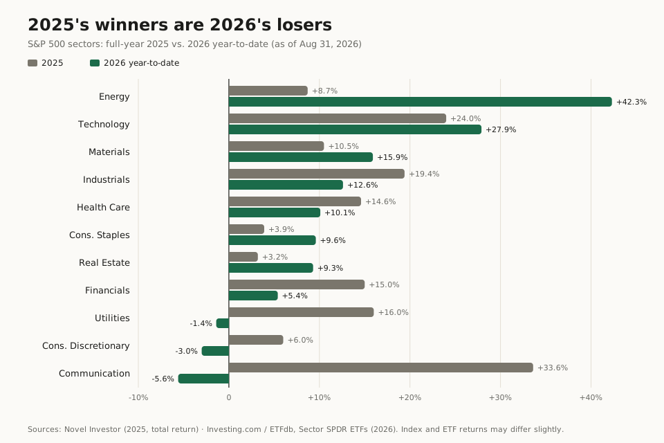
In 2025, Communication Services was the best sector in the S&P 500 at +33.6%; Energy, at +8.7%, was one of the worst. Eight months later, at the end of August 2026, Energy sits at +42% year-to-date – and Communication Services is dead last at −5.6%. The index itself, meanwhile, has quietly gone on printing record highs.
That is sector rotation. The market as a whole tells one story; beneath the surface, a completely different one is playing out. If all you watch is the index, you don't see that the capital is changing hands.
This article gives you the whole picture: what sector rotation actually is, which sectors have historically led in each phase of the business cycle, what the research says about the question "does this even work?" (the answer is less comfortable than most guides admit), how to recognize a rotation in a live market – and what is actually rotating in September 2026. I have been trading for over 16 years and have noticed rotations too late often enough to know why the subject deserves more than a textbook diagram.
The short version
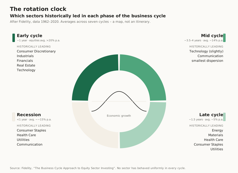
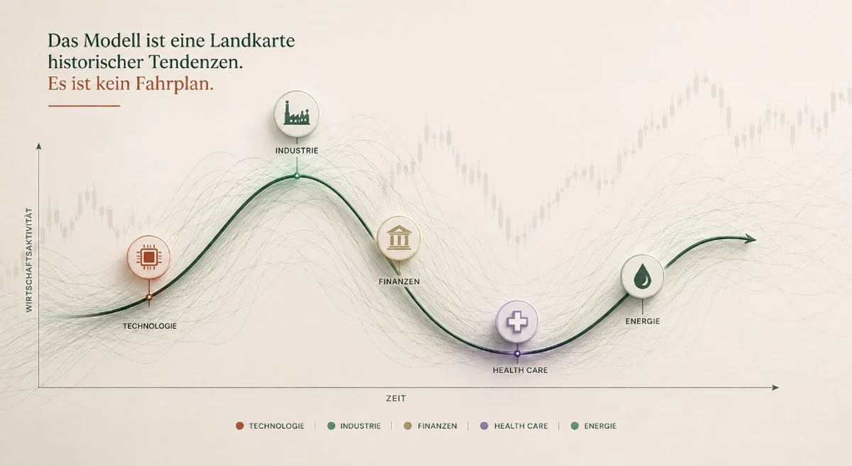
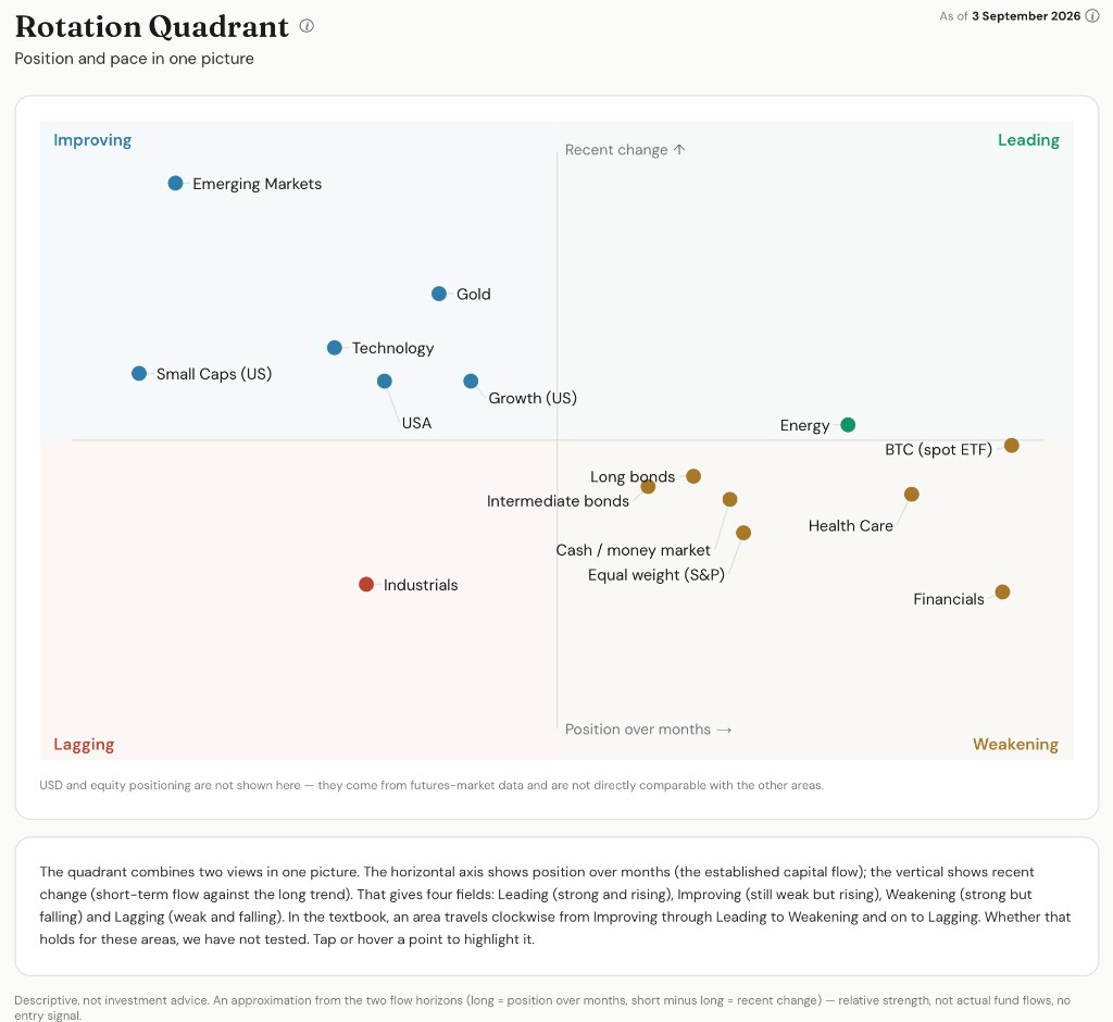
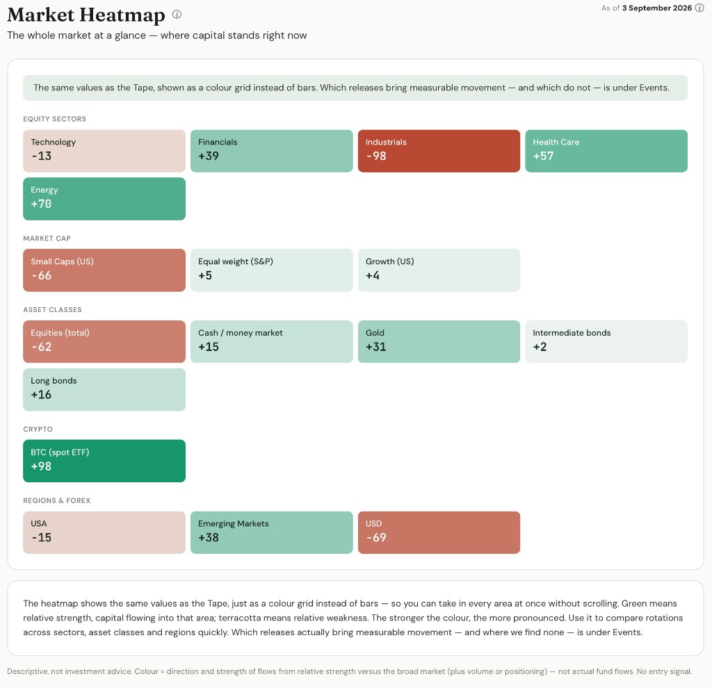
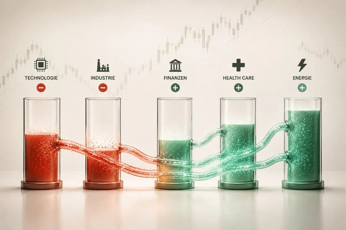
Sector rotation is the reallocation of capital between industries – visible in relative strength, not in the index. The classic model maps sectors onto the four phases of the business cycle (early: cyclicals and financials · mid: technology · late: energy and defensives · recession: consumer staples, health care, utilities). As a timing strategy it delivers only about 2 percentage points a year even with a perfect economic forecast; observable relative strength is the more robust trigger. You can spot rotation live with ratio charts, Relative Rotation Graphs, and by comparing equal-weight against cap-weighted indices. As of late August 2026, Energy leads at +42% year-to-date, and over three months capital rotated into Health Care and Financials and out of Technology.