
Follow the money.
Most tools tell you what to buy. Money Flow Tape shows you where capital is rotating and how well-supported that move is — so you can judge when a position has a tailwind, when it is running against the current, and when hedging even belongs on the table.
Rotation
Not every move is a turn.
In the markets, that has a name: sector rotation. Capital never disappears — it migrates: out of technology, into financials. Out of equities, into gold. Money Flow Tape measures this rotation daily across seventeen areas — as relative strength against the broad market, ranked against its own history.
What matters is not the move alone, but whether it is supported. That is why you see every area on two time axes at once: the past weeks and the past months.
- Seventeen areas: sectors, asset classes, regions, crypto, forex
- Two horizons side by side, opposing moves clearly flagged
- Your own portfolio laid alongside — no ISINs, no amounts
Releases
The economic calendar is obsolete.
A calendar tells you something is coming up and sticks three stars on it. It never tells you whether that release has ever moved anything. We counted — nine recurring releases, each measured on the market it actually affects.
Share of releases on which the affected market moved clearly more than usual. The threshold was fixed before any counting. The tick on each bar is that market’s ordinary-day rate — not one universal baseline. PCE sits below an ordinary trading day — four of the nine you can safely skip.
And then the bigger question: when.
Even a release that moves markets in principle does not do it every time. US GDP came in 0.6 percentage points below expectations in late July — a clear miss. The market still moved no more than on an ordinary day.
That is exactly what we record for every release: what came out, whether the market reacted, and how often this release type has historically reacted at all. Before the release you see the base rates, afterwards the result — written down immutably.
The strongest release in the market is one hardly anyone writes about.
The Bank of Japan’s rate decision moves its market more often than any inflation print and any Fed meeting — yet it barely gets a mention. We only found it because we measured on the right market: the BoJ does not show up on the S&P 500; on USD/JPY it very much does.
Impact Chains
Why is this sector falling right now?
The number alone does not answer why something moves. The Impact Chains show the channels through which a trigger feeds into which assets — rate expectations, real yields, commodity prices, the dollar, risk aversion, liquidity.
An explanatory model, explicitly not a measurement. But with the part nobody else writes down: where the textbook no longer holds. Gold has not tracked real yields since 2022 the way it is supposed to. Banks do not profit from rising rates the way everyone claims. Bitcoin has not been a safe haven since 2020.
In progress: worked shock scenarios — Covid, Brexit, Iran escalation, Ukraine.
The product
Eight modules. Each answers exactly one question.
Money Flow Tape
Where does capital stand right now, and is the move supported by the longer trend?
Events
Which releases move the market at all — and how often do they surprise?
Impact Chains
Through which channels does a trigger feed into which assets?
Exposure Matrix
Where does your own portfolio sit in the current rotation? Categories, not ISINs.
Heatmap
The whole market as a colour grid — every area at a glance, no scrolling.
Rotation Quadrant
Position and momentum in one picture: what leads, what turns, what falls back.
Trader Score
Which market is technically tradable at all — split for day and swing.
Briefing
Every Saturday in the member area: what shifted, what was reported, and what we make of it. Plus a monthly review where we check what became of our interpretations. Every issue stays in the archive.
New modules included
Whatever we add is part of the subscription. No surcharge, no upgrade tier.
Walkthrough
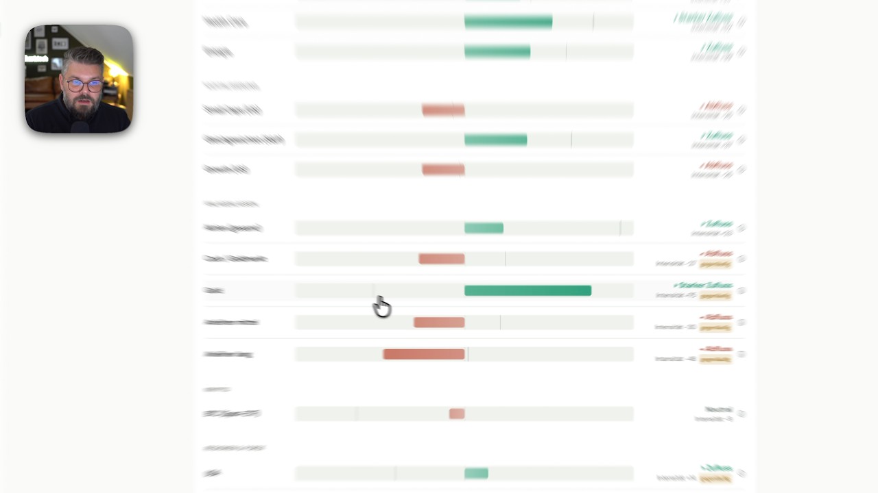
The Money Flow Tape explained in 12 minutes
Recorded in the live product. Jump straight to the part that interests you — including the one where the data is too thin and we write that down.
Rotation · Releases · your portfolio
Rotation
Releases
Modules
The walkthrough shows measurements and how they are produced — not buy or sell decisions. The video is loaded from YouTube only on click; no data goes there before that.
The Briefing
Two perspectives on the same data
Most market reports tell a new story every week and never mention the old one again. We do both: observe and settle up.
The briefing
What shifted during the week — measured, not opined.
The review
Every conjecture is checked. Even when the result goes against us.
Both formats appear in the member area. Email carries only the notice that a new issue is out — which of the two you receive is your choice in the account settings.
First monthly review on 1 September. The first resolved interpretation follows in the review of 6 October — none is due before then.
Disclosed
We also publish what did not work.
Nine ideas we tested and discarded because they did not survive a clean evaluation — including some that would have sold brilliantly. They are documented inside the product. It is uncomfortable, and it is the only reason to trust the numbers that remain.
Rules are fixed in advance
Threshold, market and expected direction are set before anything is counted.
Always against chance
Every claim stands against ordinary trading days of the same market.
Sample size always visible
Next to it you see how many cases it rests on. What is too thin, we do not show.
Nothing gets polished afterwards
If we change a rule, old results remain filed under the old rule.
The dataset keeps growing with every release. What is too thin for a claim today may be solid in two years — and you will see inside the product when that happens.
What we are working on
Updated as we go. Including the column on the right.- Weekly briefing and monthly reviewlive since August 2026
- Effect measurement for nine release types, frozen and versioned
- Impact Chains expanded to eight channels, every claim sourced
- Exposure Matrix with your own watchlist
- Shock scenarios in the Impact Chains: Covid, Brexit, Iran, Ukraine
- Tradability metric in the Trader Score
- Attributing capital moves to individual releases
- Weighting releases by the rate and inflation environment
- Seven more ideas — all documented, with reasons
Who it’s for
Three situations. If one sounds familiar, you are in the right place.
“My sector has been bleeding for three weeks. Dip — or rotation?”
Whether the outflow sits only on the short axis or on the long one too — and where the capital is going instead. When short runs against long, it says so explicitly.
“CPI and FOMC are coming next week. Do I need to do anything first?”
How often each of the two has historically moved its market at all, and how often the number came in line. Afterwards the evaluation: moved or not — recorded before anyone spins a story around it.
“The market keeps climbing, but it feels thin. Hedge?”
Whether the current move is supported by the longer trend and which releases this week could shake it. That is all this decision needs — making it is still on you.
Whether you hold positions for months, trade over weeks or hedge: the measurements are the same — descriptive, no signals. What conclusions you draw depends on your horizon.
Clear limits
Four sentences you will never hear from us.
This is how the industry usually talks. We have struck out what does not exist here — and written down what stands in its place.
No signals, no forecasts, no advice, no invented causality. What you do with the measurements is your decision — that is the design, not the excuse.
Pricing
One product. One price. Fourteen days free.
Spend two weeks watching how the rotation moves and what the releases of those weeks were really worth. Then you decide — only how to pay.
- Save €72.00 versus paying monthly
- All eight modules
- Release measurement and base rates since 2019
- Your portfolio in the rotation
- New modules included on release
* The trial is free and non-binding. The first charge happens only after the fourteen days end — on the yearly plan, the full €107.40 for the year. Cancel during the trial and nothing is charged. Purchase and billing via our reseller Digistore24 (that is what appears on your statement). Invoices, cancellation and withdrawal in the Digistore24 customer portal. For private use only.
Frequently asked
What you should know first.
Will you tell me when to hedge?
No — we give you the basis for that decision. You see whether the move in your area is supported by the longer trend or running against it, and which of this week’s releases have historically brought any movement at all. What you make of that is your call. We are not a signal service.
What does “moves measurably” mean?
The affected market’s daily range was at least one and a half times its average over the twenty trading days before — and that clearly more often than on ordinary trading days of the same market. The threshold was fixed before evaluation and is the same for every release type.
Will you tell me which release caused which price move?
No, and that is deliberate. We looked for exactly that link — with pre-registered measures, against randomly drawn comparison days — and did not find it. We show which releases bring movement, and we show where capital rotates. We do not draw an arrow between the two, because the data does not contain one.
Are the flows in the Tape real fund flows?
No. The rotation is computed from relative strength against the broad market, complemented by volume and positioning data — not from observed cash inflows into funds or ETFs. We would rather be precise than fake a data quality the source does not deliver.
Is this investment advice?
No. Money Flow Tape is an information and educational product for private use. It describes market states and publishes measurements; it does not recommend securities and gives no personal advice.
Where does the data come from?
Price and volume data from commercial providers, macro data from the US central bank’s database, positioning data from the US regulator. All publicly available, with at least one trading day’s delay.
How do the trial, cancellation and withdrawal work?
Fourteen days free and non-binding. Cancel within that time and nothing is charged. After that, cancel any time effective at the end of the term. Billing, invoices and withdrawal run through Digistore24.
What is sector rotation — and what does Money Flow Tape show of it?
Sector rotation is the migration of capital between industries and asset classes — for example out of technology into financials when rate expectations turn. In equities it often shows up before individual prices do: whole sectors gain or lose relative strength. Money Flow Tape measures this rotation daily across 17 areas and shows how well-supported a move is — purely descriptive, without signals or recommendations. Full guide →
See where the money is going — before you change anything about your positions.
Two weeks free. From €8.95 a month after.